Introduction
Walkable tourism zones—think historic downtowns, waterfronts, market streets, and cultural corridors—rise or fall on how easy they are to navigate and how memorable they feel. In these human-scaled environments, signage is not just informational; it is architectural, cultural, and commercial. Carved signs, in particular, excel because they marry craftsmanship with clarity, giving pedestrians high-contrast, tactile cues that draw the eye at sidewalk pace.
This guide breaks down how carved signs serve wayfinding, brand storytelling, and economic development in walkable districts. You’ll learn design standards, materials and finishes, lighting strategies, accessibility best practices, and practical steps to plan, budget, and measure ROI. Whether you manage a business improvement district, operate a storefront, or design multi-tenant signage programs, you’ll find actionable guidance to specify carved signage that performs and lasts.
The Role of Carved Signs in Walkable Tourism Zones
1) Why carved signs work where people walk
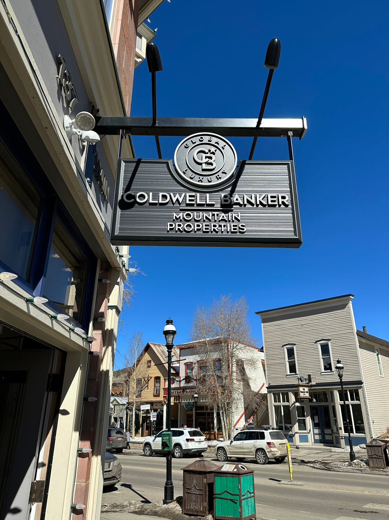
Pedestrians experience a street at 2–3 mph. That makes texture, shadow, and dimensional detail noticeable in a way that’s lost at driving speeds. Carved signs—incised or relief—create real depth. Shadows around raised letters improve legibility, while the materiality (wood grain, tool marks, gilded accents) signals authenticity and care. This combination:
-
Grabs attention at short to mid-range distances.
-
Communicates quality and trust for hospitality, retail, and cultural venues.
-
Supports placemaking by reinforcing local craft traditions and historic character.
2) Placemaking and wayfinding in pedestrian networks
A walkable zone must do three things well: orient visitors, direct them, and reward their attention. Carved signs can serve each layer of a district-wide wayfinding system:
-
Gateway markers: District entrances or archways with carved identity panels anchor sense of arrival.
-
Directional blades and fingers: Pedestrian-scaled signs with carved arrows and icons guide to landmarks, markets, parks, transit, and restrooms.
-
Trail and loop identifiers: Carved route markers and mileposts add charm to heritage walks and waterfront promenades.
-
Interpretive panels: Incised graphics for historic facts, flora/fauna, or art narratives add value to the stroll.
A consistent carved vocabulary—typefaces, borders, iconography, and finishes—knits the network together so visitors feel oriented rather than overwhelmed.
3) Brand storytelling and the “signature moment”
In crowded districts, shoppers choose with their feet. A well-designed carved sign becomes a storefront’s “signature moment”—the photo that appears in reviews and gets shared online. Dimensional letterforms, hand-painted ornament, or a touch of gold leaf communicates brand position instantly: rustic artisanal, refined boutique, coastal casual, or heritage luxury. For multi-tenant environments, a carved directory with carefully calibrated brand areas respects individuality while keeping a coherent streetscape.
4) Visibility and legibility: practical rules that work
Legibility is non-negotiable. Use these field-tested guidelines for pedestrian contexts:
-
Letter height vs. viewing distance: Plan approximately 1 inch of letter height for every 10 feet of viewing distance. For a sidewalk blade sign read at 30 feet, 3–4 inch primary letters are a safe bet.
-
Typefaces: Favor simple, open forms with generous counters. Avoid ultra-condensed styles. Script can work for a single wordmark; keep descriptors in a clean sans or serif.
-
Contrast: Aim for high luminance contrast between letters and background. As a benchmark, a 4.5:1 contrast ratio aligns with accessible reading on the web and maps well to real-world legibility.
-
Hierarchy: Prioritize the brand name, then the offer (e.g., “Coffee & Pastries”), then tertiary details (hours, level, arrows).
-
Whitespace: Carved borders and adequate margins protect legibility; crowding reduces contrast and makes the sign feel cheap.
-
Placement: Blade signs perpendicular to the building line capture foot traffic from both directions; a minimum 7–8 ft sidewalk clearance to the bottom ensures head safety.
5) Materials and fabrication that stand up to the streets
The craft choices behind a carved sign determine its lifespan and maintenance needs:
-
High-Density Urethane (HDU): Lightweight, stable, rot- and insect-resistant; accepts crisp carving and paint. Excellent for most locations.
-
Cedar/Redwood: Traditional warmth with beautiful grain; choose properly kiln-dried stock, seal all sides, and detail for drainage.
-
Hardwoods (e.g., oak, sapele): Dense and durable when properly finished; ideal for premium historic settings.
-
Engineered cores: Marine-grade plywood or aluminum backers reduce warping on larger panels.
-
Incised vs. relief vs. dimensional letters:
-
Incised: Letters cut into the face; paint fills accentuate contrast.
-
Relief: Background is carved away, letters stand proud; dramatic shadow lines.
-
Applied dimensional letters: CNC or hand-carved letters fastened to panels; allows mixed materials (e.g., metal letters on wood).
-
Hardware: Use stainless steel or powder-coated fasteners and brackets. Hidden cleats protect the aesthetic and reduce tampering.

6) Finishes, color systems, and lighting
Finish quality often separates premium signage from also-ran installations:
-
Primers and topcoats: Use marine-grade or architectural coatings with UV inhibitors. For wood, seal all edges and ends; for HDU, build paint film thickness for durability.
-
Gilding: 23k gold leaf on raised elements is visible even in low light. It suggests heritage craft and premium positioning.
-
Stains and clear coats: For wood-forward brands, exterior oil-modified urethanes or spar varnishes offer protection; expect periodic refreshes.
-
Lighting:
-
Gooseneck fixtures offer classic storefront character.
-
Integrated edge wash or discreet linear fixtures can evenly light relief carving.
-
Dark-sky friendly optics and shields reduce glare and protect neighborhood ambiance.
-
Low-voltage LED systems minimize energy and maintenance.
7) Accessibility and inclusivity
Accessible signage improves the experience for everyone:
-
Contrast and letterforms: Keep contrast high and avoid fussy letter shapes.
-
Glare control: Matte finishes reduce specular glare for easier reading in sunlit streets.
-
Mounting height consistency: Maintain predictable reading zones (e.g., 48–60 inches to the main reading line for wall plaques).
-
Tactile elements where appropriate: For interpretive panels, raised letters or Braille can be valuable in civic settings.
-
Iconography and multilingual support: Pictograms for restrooms, transit, and information help international visitors and children. QR codes can deliver translations.
8) Working with sign codes, historic review, and landlords
Walkable districts often sit inside overlay zones with specific rules:
-
Projection limits & clearances: Blade signs typically must clear sidewalks by 7–8 ft and project no more than a specified distance (e.g., 4 ft).
-
Area calculations: Total sign area as a function of storefront width keeps the streetscape balanced.
-
Historic review boards: Expect guidelines on materials, illumination, and color palettes. Carved signs are often preferred in heritage contexts.
-
Master sign programs (MSPs): Multi-tenant properties may require carved sign formats for cohesion while allowing brand differentiation.
9) Sustainability considerations
Many districts prioritize greener specs:
-
Responsible timber: FSC-certified wood and verified supply chains.
-
Low-VOC coatings: Improve air quality for installers and the public.
-
LED lighting & controls: Pair photocells with timers to cut energy use.
-
Modular updates: Design interchangeable date tabs or tenant panels to reduce waste.
-
Refurbish over replace: Carved signs can be sanded, repainted, and re-gilded, extending service life.
10) Budgeting and ROI for businesses
A realistic budget aligns expectations and results:
-
Typical cost drivers: Size, complexity of carving, gilding, custom brackets, permits, and lift access.
-
Smart trade-offs: Spend on legibility (letter size, contrast) and weathering resistance first; add gilding or sculpted motifs where they’ll be most visible.
-
Measure the return: Track footfall changes, dwell time, and conversion rate pre/post install. A single strong sign can act like a year-round ad buy with no monthly media cost.
11) Common mistakes to avoid
-
Undersized letterforms for the viewing distance.
-
Low contrast color choices that wash out in daylight.
-
Ignoring lighting, which halves nighttime impact.
-
Over-ornamentation that sacrifices clarity.
-
Inadequate sealing of wood edges and hardware penetrations.
-
Skipping approvals and ending up with rework after inspection.
12) Measuring success: simple metrics that matter
-
Before/after footfall (manual counts or sensors).
-
Storefront conversion rate (entries ÷ passersby).
-
Average order value and basket mix for retail/food.
-
Photo shares and map saves (user-generated content).
-
Wayfinding efficacy (decreased “Where is…?” inquiries).
-
Maintenance KPIs (finish integrity, lighting uptime).

FAQs (Frequently Asked Questions)
1) Are carved signs worth the higher upfront cost compared to flat printed signs?
Yes for pedestrian districts. Carved signs provide dimensional shadowing and tactile quality that read better at sidewalk distance, last longer with proper coatings, and elevate brand perception. Over a 7–10 year horizon, they typically deliver lower cost per year and stronger revenue impact.
2) Which material should I choose: wood or HDU?
Choose HDU for maximum stability, light weight, and coastal or high-moisture environments; it carves crisply and holds paint well. Choose wood (cedar, redwood, or select hardwoods) when you want natural grain, heritage character, or to match historic guidelines. Many projects blend both—wood frames with HDU faces.
3) How big should my letters be for a walkable street?
Use a practical rule: ~1 inch of letter height per 10 feet of viewing distance. For a sign legible at 30 feet, target 3–4 inch primary letters. Maintain high contrast and generous spacing.
4) What lighting works best with carved signs?
LED goosenecks offer classic styling and focused light. Linear edge wash fixtures can evenly graze relief surfaces. Use shields or optics to limit glare and follow dark-sky principles. Combine photocells with timers for efficiency.
5) How do I keep a carved sign looking new?
Specify premium exterior primers/topcoats, seal all edges and penetrations, and establish a cleaning and inspection checklist. Plan a light refresh (touch-ups or clear coat) every 3–5 years based on exposure. Consider an anti-graffiti clear finish in high-traffic alleys or transit corridors.
6) What approvals should I anticipate?
Expect sign permits, landlord master sign program conformance, and possible historic review. Typical rules govern projection, clearance, total area, lighting, and materials. A qualified fabricator will prepare drawings and anchor details for submission.
Conclusion
Walkable tourism zones reward brands that invest in human-scale details. Carved signs deliver that edge: they are legible, durable, and unmistakably crafted—performing as navigational tools, brand ambassadors, and place-making assets all at once. By following clear visibility rules, choosing appropriate materials and finishes, integrating thoughtful lighting, and planning for maintenance and code compliance, businesses can deploy carved signs that welcome visitors, guide them effortlessly, and create the kind of streetscape people cross town to experience.
If you’re planning signage for a storefront or multi-tenant environment, start with an on-site audit, clarify brand goals, and prototype sizes at real scale. From there, partner with a fabricator who understands carving, coatings, and code. The result is a sign program that reads beautifully by day and night, sustains its finish season after season, and helps your district feel both cohesive and distinct—exactly what walkable places are built to deliver.
Getting high-quality 3D carved signs has never been this easy! We use only the highest quality material and paint finishes available for unmatched elegance and longevity. Check out Carved Signs and our outstanding sign collection. Just pick your style and customize it - we do the rest! Feel free to contact us online or call us at +1 (970)-455-8443.
