Introduction
When a sign face has texture—carved wood grain, sandblasted HDU, chiseled stone, bead-blasted metal—the finish you choose can make the difference between a message that snaps into focus and one that disappears in a wash of glare or muddy contrast. Finish is not just an aesthetic decision; it directly affects readability, brand perception, maintenance, and longevity.
This guide breaks down how matte, satin, and gloss finishes interact with textured surfaces, what that means for visibility at different angles and distances, and how lighting, color, and environment influence the right choice. You’ll find a practical decision framework, common pitfalls to avoid, and recommendations by substrate and setting. The goal is simple: help you specify a finish that reads clearly, looks intentional, and holds up to real-world use.
Which Finish Reads Best on Textured Surfaces: Matte, Satin, or Gloss?
How Texture Changes the Rules
A textured surface scatters light. Peaks and valleys create tiny highlights and shadows that can either add crisp dimensionality or introduce visual noise. The finish you apply acts like a lens on that micro-topography:
-
Matte scatters incident light (diffuse reflection), reducing specular glare. On texture, this can quiet down harsh hotspots and make letterforms appear more uniform from a wide range of viewing angles.
-
Satin sits between matte and gloss. It keeps many of the anti-glare benefits of matte, yet preserves some depth and color richness. On texture, satin often sharpens edges slightly without creating mirror-like hotspots.
-
Gloss reflects light specularly, which intensifies highlights and perceived saturation. On a smooth surface this can look premium. On texture, gloss can amplify micro-highlights and glare, potentially breaking up strokes and counters (the “holes” in letters) for viewers at off-angles.
Key takeaway: On textured sign faces, satin often offers the best readability across varied lighting, with matte a close second where glare control is paramount. Gloss can look luxurious but is the most sensitive to light angle and may reduce legibility under strong, uncontrolled light.
Sheen, Light, and Legibility: The Physics in Plain English
-
Specular reflection (gloss) behaves like a mirror. If the viewer’s eye, the light source, and the sign surface align, you’ll see a bright hotspot. On texture, dozens of micro-mirrors create a constellation of sparkles that can overpower letterforms.
-
Diffuse reflection (matte) spreads reflected light in many directions. That helps viewers see the same message from many angles with less glare. The trade-off is slightly reduced color depth and “snap.”
-
Semi-specular (satin) blends both behaviors. You get some perceived depth and edge clarity with fewer hotspots.
For signs, the crucial factor is contrast under real lighting—daylight, headlights at night, lobby downlights, grazing wall washers, or neon reflections. A finish that performs beautifully in a controlled showroom can falter under a storefront’s south-facing glare.
Finish by Environment
Outdoor Daylight (Uncontrolled Light)
-
Best overall: Satin
Maintains color and edge clarity while limiting glare across the day’s changing sun angles. -
When to choose matte: Extremely bright sites, reflective surroundings (glass buildings, water), or when the sign is frequently viewed off-axis (e.g., at a corner where pedestrians approach from many angles).
-
Use gloss sparingly: If the brand demands high sheen, limit gloss to accent elements (borders, logos) rather than the entire field or typography.
Nighttime with External Lighting
-
Spotlights/grazing lights: Matte or satin helps avoid blown-out highlights. Gloss under a grazing beam can create streaks that fracture readability.
-
Mixed urban lighting (headlights, signage, street lamps): Satin gives latitude; matte for maximum glare control near roads or busy intersections.
Interior, Controlled Lighting
-
Retail, hospitality, corporate lobbies: Satin typically wins for balance and perceived quality.
-
Museums, galleries, high-CRI lighting: Matte can be ideal to reduce reflections while preserving true color under calibrated lighting.
-
Premium/luxury brand zones: Consider gloss accents—logo lockups, inlays—against a matte or satin field to keep type readable.
Finish by Substrate
Carved Wood (Cedar, Redwood, Sapele, etc.)
-
Grain and carving depth amplify micro-highlights.
-
Satin: Best reading balance; respects grain without glare.
-
Matte: Great outdoors; quiets the grain if it’s busy.
-
Gloss: Striking but risky in sun; consider spot gloss on a logo medallion only.
HDU (High-Density Urethane), Sandblasted or Routed
-
Uniform texture, crisp peaks.
-
Satin: Keeps edges sharp and shadows legible.
-
Matte: Excellent for large sign fields or long read distances.
-
Gloss: Reserve for smooth, raised elements; full-gloss fields can sparkle distractingly.
Metal (Cast/Bas-Relief, Bead-Blasted, Brushed)
-
Metal already reflects; texture adds complexity.
-
Matte clear or low-sheen powder coat for readability and fingerprint control.
-
Satin clear on brushed metals preserves premium feel without mirror glare.
-
High gloss on textured metal can create a shimmering effect that breaks letter continuity.
Stone (Chiseled, Sandblasted)
-
Irregular facets scatter light unpredictably.
-
Matte sealer for maximum legibility.
-
Satin sealer when you want a subtle richness.
-
Gloss sealer is rarely recommended for text legibility on stone texture.

Color, Contrast, and Finish Work Together
Finish only solves part of the legibility puzzle. To build readable signs on textured surfaces:
-
Maximize luminance contrast
Dark letters on a light field (or vice versa) remain the strongest factor for readability. Avoid mid-tone-on-mid-tone schemes that depend on sheen differences to separate forms. -
Use finish contrast strategically
-
Matte field with satin or semi-gloss lettering can make type “pop” without glare.
-
Satin field with matte lettering reduces haloing around strokes.
-
Reserve full gloss for small brand marks or borders.
-
Hue and saturation
Highly saturated colors look richer in higher sheen, but on texture that richness can come with glare. If a brand color demands saturation, test it in satin first. -
Stroke weight and letter size
Texture visually “eats” thin strokes. Increase letter thickness or scale for carved faces; pair with matte/satin to maintain edge clarity.
Viewing Distance and Angle
-
Close range (2–10 ft): Surface detail is noticed; matte/satin prevent micro-highlights from breaking edges.
-
Medium range (10–30 ft): Satin often reads best—enough depth to keep letters distinct without glare.
-
Long range (30+ ft): Contrast and scale dominate. Satin remains the safest pick; matte can look flatter but consistent. Gloss may punch color at dead-on angles but is unreliable as viewers shift.
Maintenance, Durability, and Cost
-
Cleaning:
-
Gloss wipes clean easily; fingerprints and smudges show on smooth gloss, less so on texture but glare highlights them.
-
Matte hides fingerprints but can show “burnishing” (shiny rub marks) after repeated cleaning.
-
Satin is the maintenance sweet spot.
-
Weathering and UV:
Higher-sheen coatings often retain color and gloss longer outdoors, but on texture their glare drawbacks may outweigh that benefit. Modern satin exterior clears and topcoats provide excellent UV stability. -
Scratch and abrasion:
Gloss can reveal scratches as bright lines. Matte masks micro-scratches but can polish under abrasion. Satin again balances both. -
Anti-graffiti topcoats:
Many are naturally higher sheen. Ask your finisher for low-sheen anti-graffiti products compatible with your base coat if glare is a concern. -
Cost:
Differences between sheens are usually minimal compared to labor. Complexity increases with dual-sheen strategies (masking, selective clear). Budget accordingly.
ADA/Accessibility Considerations
-
Prioritize high contrast between characters and background and non-glare finishes in public environments where accessibility matters. Many jurisdictions recommend or require low-glare surfaces for readability. Confirm local codes and standards for your project type and location.
-
Tactile and Braille signage should use finishes that do not introduce gloss glare on raised characters; matte or satin is recommended.
Brand Expression Without Sacrificing Readability
-
Heritage/craft brands: Matte or satin on carved wood communicates authenticity and warmth; add gold leaf or spot gloss accents for hierarchy.
-
Premium/luxury: Use satin overall to maintain legibility, then targeted gloss on logos or decorative borders for sparkle under controlled light.
-
Modern/minimal: Satin on smooth raised letters over a matte field keeps the look clean while preserving edge contrast.
A Practical Selection Framework
Step 1: Audit the site lighting
-
Sun path, nearby reflective surfaces, typical viewer paths, nighttime illumination.
-
If lighting is variable or harsh → lean satin or matte.
Step 2: Assess the texture
-
Deep, irregular, or sparkly texture → avoid full-field gloss.
-
Subtle, consistent texture → satin usually ideal.
Step 3: Define viewing conditions
-
Multiple angles and distances → satin for versatility.
-
Primarily straight-on, controlled lighting → consider selective gloss accents.
Step 4: Lock color and contrast
-
Choose high-contrast pairs; avoid relying on sheen to separate mid-tones.
Step 5: Prototype and test
-
Create sample plaques with your actual substrate, colors, and sheens.
-
Evaluate at site, different times of day, and from realistic distances.
Common Mistakes (and Easy Fixes)
-
Gloss everywhere on rough texture
-
Fix: Switch to satin field with gloss accents at most.
-
Underestimating glare from grazing light
-
Fix: Specify matte or satin, re-aim fixtures, or add diffusers/shields.
-
Relying on sheen instead of contrast
-
Fix: Increase luminance contrast; use color values that separate clearly.
-
Ignoring viewing angles
-
Fix: Walk the site; test samples from approach paths.
-
Thin typography on carved faces
-
Fix: Increase stroke weights; choose type that survives texturing.
-
Skipping maintenance planning
-
Fix: Select finishes compatible with your cleaning regimen and consider low-sheen anti-graffiti if tagging is likely.
Recommendations at a Glance
-
Default for textured signs: Satin
Most readable across conditions, balances depth and glare control. -
High-glare environments or roadside visibility: Matte
Prioritize non-glare readability; pair with strong color contrast. -
Premium accenting in controlled light: Gloss (selective)
Use for logos or borders only; avoid full-field gloss on heavy texture. -
If unsure: Build a three-panel mockup (matte, satin, gloss) with your exact colors and substrate, then review on site at morning, noon, and dusk.

FAQs (Frequently Asked Questions)
Q1: Is matte always the safest choice for textured outdoor signs?
Matte is the safest against glare, especially in bright or unpredictable light, but it can mute color depth slightly. Satin often provides a better overall balance outdoors—nearly as glare-resistant as matte while keeping edges crisp and colors lively. If your site is extremely bright or reflective, matte may still be the top pick.
Q2: Will gloss make my textured sign look more premium without hurting readability?
Full-field gloss on heavy texture often introduces sparkle and hotspots that can fracture letterforms. If you want a premium feel, apply gloss selectively—for example, on a logo medallion or smooth raised border—while keeping the primary reading field satin.
Q3: Which finish hides dirt and fingerprints best on textured surfaces?
Textures already disguise some smudges, but finish still matters. Satin tends to show fewer fingerprints than gloss and less burnishing than matte after repeated cleaning. It’s the maintenance sweet spot for many carved and sandblasted signs.
Q4: Do anti-graffiti coatings force me into a glossy look?
Not necessarily. Many anti-graffiti systems are available in low-sheen or satin variants. Ask your finisher to match your desired sheen, and confirm compatibility with your paint system and substrate.
Q5: Can I mix sheens to improve legibility?
Yes. A matte field with satin letters or a satin field with matte letters can sharpen edges and improve reading without glare. Mixing sheens is a cost-effective way to create hierarchy and emphasis on textured faces.
Q6: What’s the best finish for gold leaf or metallic accents on a textured sign?
Gold leaf and metallics already catch light. Keep surrounding fields matte or satin to frame the metallics without competing hotspots. If you want extra sparkle, add gloss only to the metallic elements, not the entire sign face.
Conclusion
Texture brings character to carved and dimensional signs, but it also raises the stakes for finish selection. On uneven surfaces, the wrong sheen can scatter highlights, wash out strokes, and compromise readability. In most real-world applications—especially where lighting conditions change throughout the day—satin delivers the best balance of legibility, color richness, and maintenance. Matte is the go-to for high-glare environments and accessibility-focused installations, while gloss works best as a selective accent in controlled lighting to express brand polish without sacrificing clarity.
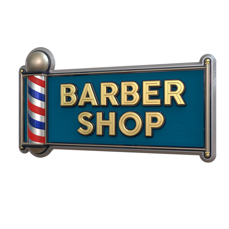
Getting high-quality 3D carved signs has never been this easy! We use only the highest quality material and paint finishes available for unmatched elegance and longevity. Check out Carved Signs and our outstanding sign collection. Just pick your style and customize it - we do the rest! Feel free to contact us online or call us at +1 (970)-455-8443.
