Introduction
You’re buying a carved sign to be noticed quickly, understood instantly, and remembered later. Style matters—but only if people can read the words at a glance. Some font choices help that happen every day in real-world conditions like sun, rain, shade, and passing traffic. Others make the message harder to catch.
Hand-drawn or sketch-style fonts feel personal and “artisan.” On menus, packaging, and social posts, that charm can work. On carved signs, those same quirks often slow down reading, fade at a distance, and age faster outdoors. This guide is written for buyers. You’ll get plain-language reasons why those fonts underperform on carved signs, plus straightforward alternatives that preserve personality while keeping your sign crisp, confident, and easy to read.
Why Hand-Drawn Fonts Hurt Carved Sign Readability (and What to Use Instead)
The buyer’s goal in one line
A great carved sign should land your main message in one second—from the sidewalk, the car window, or across the plaza.
Hand-drawn fonts build in irregularity by design. On a carved sign, that often turns into:
-
Slower reads – people have to work to decode the words.
-
Weaker distance impact – thin lines and busy loops fade or blur.
-
More upkeep – tiny details wear faster and look tired sooner.
-
Inconsistent results – replacements or second locations don’t match perfectly.
If your sign must attract new customers (not just delight existing fans), choose letter shapes that read instantly and stay sharp for years.
The quick reality check (no jargon)
-
Small details get lost outdoors. Harsh light, deep shade, and quick glances punish fussy lettering.
-
Even spacing beats flair. Steady, upright letters form clear word shapes your eye can catch fast.
-
Clean strokes age better. Simpler shapes resist chipping, repainting buildup, and grime.
-
Fewer flourishes = stronger name recognition. The brand name pops; the rest supports it.
What to use instead (keeps style, improves clarity)
Here are buyer-friendly font categories that look polished on carved signs and perform in real life:
-
Humanist Sans Serifs
Warm, modern, and highly readable. Great for approachable professional brands, hospitality, wellness, and retail. -
Slab Serifs
Confident and classic. The sturdy, rectangular ends read well at a distance and under different lighting. -
Low-Contrast Serifs
Refined without fragile hairlines. Ideal for premium boutiques, studios, clinics, and heritage brands.
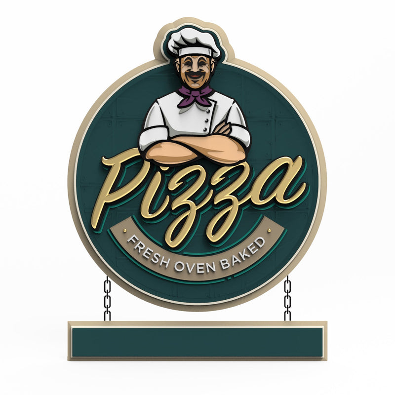
Tip: You don’t need a “plain” look. Use a clear primary font for the business name and express personality with color, layout, borders, textures, or one accent word in a tasteful script.

Simple sizing rules that just work
-
Pedestrian areas: About 1 inch of letter height for every 10 feet of viewing distance.
-
Drive-by streets: About 1 inch for every 25 feet (go larger for faster roads or higher mounting).
-
Keep short, bold headlines and concise info lines (web, phone, hours). Avoid long sentences.
Color and finish that make words pop
-
High contrast wins: light letters on a dark panel or dark on light.
-
Control glare: satin or eggshell backgrounds with semi-gloss letters keep edges crisp in the sun and under spotlights.
-
Selective sparkle: gold leaf or metallic accents shine best against a simple, darker field.
-
Reality check outdoors: View samples in daylight and shade before you approve.
Where to put the “handcrafted” vibe (without hurting readability)
-
Use a tasteful script or signature on one large word (often the brand name) if it’s bold and simple.
-
Add personality in borders, icons, textures, or panel shapes—not inside every letter.
-
Carry the hand-drawn style into menus, packaging, labels, and social graphics, where people have time to enjoy detail.
A quick buyer checklist before you approve artwork
-
One-second test: Stand back to the viewing distance. Can you read the name instantly?
-
Print at full size: Ask for a 1:1 proof of the smallest text and tape it at the intended height.
-
Check contrast outdoors: Look at color samples in sunlight and shade.
-
Trim the words: If a line feels crowded, shorten it or stack it cleanly.
-
Think ahead: Will this font and layout still look sharp when you add a second sign next season?

FAQs (Frequently Asked Questions)
Q1: We love a handmade feel. Can we keep it?
Yes—use it strategically. Choose a clean, readable font for most wording. If you want a handcrafted touch, apply a simple script to one keyword or use hand-drawn borders, badges, or background textures. You’ll keep the vibe and still be easy to read from the street.
Q2: Will a “clean” font look boring?
Not when the overall sign is well designed. Shape, color, depth, texture, and lighting deliver character. A clear font actually makes the design feel more premium because the message lands fast and looks intentional.
Q3: Our logo uses a decorative typeface. Do we have to change it?
No. Many buyers keep the logo mark (or a slightly simplified version) and pair it with a readable companion font for the business name or secondary lines. Your brand still feels like you, while the sign works better.
Q4: Does a simpler font really help sales?
Clarity boosts awareness, foot traffic, and recall. People can only act on what they can read. A fast read turns more passing glances into visits, especially for restaurants, retail, salons, clinics, and destination venues.
Q5: What if we want something elegant or high-end?
Pick a low-contrast serif or a refined slab serif in a balanced layout. Combine with rich color, subtle textures, and quality finishes (like gilding on key strokes). You’ll get a premium look that still reads at a glance.
Q6: How do we keep the sign looking great over time?
Choose sturdy letter shapes, high-contrast colors, and a quality finish system. Keep copy short, clean the sign periodically, and refresh the topcoat as recommended. Designs that start simple stay sharp longer.
Conclusion
A carved sign is a long-term brand asset. The fastest way to protect that investment is to favor letter styles that people can read instantly in real-world conditions. Keep the charm and character in your colors, textures, layout, and selective accents, and let the main words stay clear and confident.
Do that, and you’ll own a sign that looks artisan-made, feels on-brand, and most importantly, does its job the very moment someone looks up.
Getting high-quality 3D carved signs has never been this easy! We use only the highest quality material and paint finishes available for unmatched elegance and longevity. Check out Carved Signs and our outstanding sign collection. Just pick your style and customize it - we do the rest! Feel free to contact us online or call us at +1 (970)-455-8443.
