Introduction
Signage plays a crucial role in attracting attention, conveying messages, and reinforcing brand identity. Whether you are using carved signs for your business or public space, the color choices you make significantly impact their effectiveness. Bright colors, in particular, can make signage more noticeable, memorable, and engaging. But why do bright colors work so well? This article explores the science, psychology, and practical applications of bright colors in signage and how they can benefit businesses looking to improve their visibility.
Why Bright Colors Make Your Signage More Noticeable and Effective
1. The Science Behind Bright Colors
Bright colors stand out because they stimulate the human eye more than muted or neutral tones. The way light interacts with different colors affects their visibility, making vibrant hues easier to distinguish from their surroundings. High-contrast combinations, such as yellow on black or red on white, increase legibility and make signage more effective, even from a distance.
Additionally, studies show that bright colors have a higher wavelength, meaning they are more likely to catch attention quickly. This phenomenon is why emergency and warning signs often use bright colors like red, yellow, and orange—these hues trigger an immediate response in the brain, ensuring they are noticed faster than subdued tones.

2. Psychological Impact of Bright Colors
Different colors evoke various emotions and responses. Here are some of the most commonly used bright colors in signage and their psychological effects:
-
Red: Creates urgency, stimulates excitement, and grabs immediate attention.
-
Yellow: Associated with happiness and optimism, enhances readability, and attracts the eye.
-
Orange: Conveys energy and enthusiasm, often used for calls to action.
-
Green: Represents growth, nature, and tranquility, ideal for eco-friendly branding.
-
Blue: Instills trust and professionalism while maintaining visual appeal.
-
Purple: Suggests luxury, creativity, and sophistication, making it stand out uniquely.
Choosing the right color based on the intended message can enhance the impact of signage and improve engagement. Furthermore, color psychology plays a crucial role in marketing, with businesses using different color schemes to influence customer behavior.
3. Increased Readability and Visibility
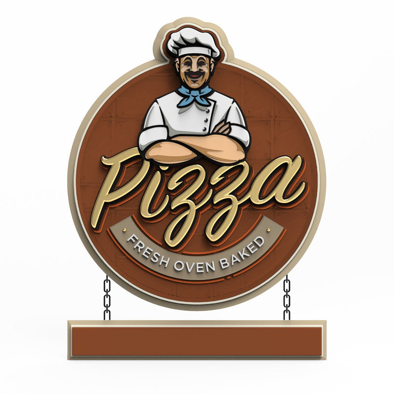
A sign’s effectiveness depends on how easily it can be read and recognized. Bright colors enhance readability by providing a stark contrast against backgrounds. This is particularly crucial for carved signs, where shadows and texture can impact visibility. High-contrast color pairings, such as white text on a bright red background, ensure that important information is quickly absorbed.
Moreover, studies indicate that signage with high contrast and vibrant colors significantly improves recall rates. When people remember a sign more easily, they are more likely to engage with the business it represents.
4. Boosting Brand Recognition
Consistent use of bright colors in signage reinforces brand identity. Many successful companies use bold colors to make their logos and signage instantly recognizable. Think of McDonald’s red and yellow or Home Depot’s bright orange—these colors become synonymous with their brands. Implementing bright colors in carved signage helps businesses achieve the same effect, making them more memorable to customers.
A strong brand identity increases customer loyalty and encourages word-of-mouth marketing. When businesses choose bright colors that align with their branding, they create a visual association that helps customers recall their services or products more effectively.
5. Drawing Attention in Competitive Environments
In busy commercial districts, trade shows, or crowded streets, signage competes for attention. Bright colors naturally draw the eye, ensuring that a business’s message doesn’t get lost in the visual clutter. Whether used in storefront signage or promotional displays, vibrant hues help businesses stand out from competitors.
Additionally, businesses in high-traffic areas must ensure their signage is dynamic and engaging. Bright colors paired with bold fonts and effective imagery can further enhance the impact of signage, making it more likely to capture attention even in the busiest settings.
6. Enhancing Nighttime and Low-Light Visibility
Carved signs with bright colors remain visible even in low-light conditions, especially when combined with proper lighting techniques. Fluorescent or highly reflective paints can further improve visibility during nighttime, ensuring that signs remain effective 24/7.
Business owners can also incorporate LED lighting or backlit features to enhance bright-colored signage. This technique is especially useful for businesses operating during evening hours, such as restaurants, entertainment venues, and retail stores.
7. Encouraging Customer Engagement
Bright colors evoke emotions and can influence purchasing behavior. Studies show that color can impact consumer decision-making, with nearly 85% of consumers citing color as the primary reason they choose a product. Using the right combination of bright colors in signage can encourage customers to engage with a business, whether it’s visiting a store, making a purchase, or remembering the brand for future interactions.
Moreover, businesses that strategically use bright colors in their signage often experience increased foot traffic. Eye-catching colors not only make signage more visible but also create an inviting atmosphere that draws customers in.

FAQs (Frequently Asked Questions)
Q1: What is the best bright color for signage?
The best color depends on the purpose of the signage. Red, yellow, and orange are highly effective for grabbing attention, while blue and green can create a more professional and trustworthy appearance.
Q2: Do bright colors work for all types of businesses?
Yes, but the choice of colors should align with the brand’s message and target audience. For example, a daycare center may use bright primary colors, while a law firm may opt for a bold yet professional palette like blue and gold.
Q3: Can bright colors be used effectively in carved signage?
Absolutely. Bright colors enhance the depth and texture of carved signs, making the lettering and details more prominent. Pairing them with contrasting backgrounds further improves legibility.
Q4: How do I ensure my signage remains readable with bright colors?
Use high-contrast color combinations and avoid overly complex designs. Testing signage in different lighting conditions can also help optimize readability.
Q5: Are there industries where bright colors should be avoided?
Certain industries, like luxury brands or formal businesses, may opt for muted tones to maintain an elegant image. However, even in these industries, selective use of bright colors for emphasis can be effective.
Q6: How do I choose the right bright colors for my signage?
Consider the emotions you want to evoke, your brand identity, and the visibility needs of your signage. Consulting a professional designer can also help create a cohesive and impactful color scheme.
Conclusion
Bright colors play a vital role in making signage more effective by enhancing visibility, improving readability, reinforcing brand identity, and attracting customer attention. For businesses investing in carved signs, selecting the right color combinations can maximize their impact and ensure their message stands out in any environment. By understanding the science, psychology, and strategic use of bright colors, businesses can create signage that not only looks appealing but also drives customer engagement and brand recognition. Investing in well-designed, color-optimized signage can make a significant difference in a company’s success.
Getting high-quality 3D carved signs has never been this easy! We use only the highest quality materials and paint finishes available for unmatched elegance and longevity. Check out Carved Signs and our outstanding sign collection. Just pick your style and customize it - we do the rest! Feel free to contact us online or call us at +1 (970)-455-8443.
