Introduction
3D carved signs are a powerful tool for making a lasting impression. Whether displayed on storefronts, in lobbies, or at trade shows, these dimensional signs combine visual appeal with tactile presence. But while materials and lighting often take center stage in design discussions, one factor often overlooked is typography. The right font can elevate a 3D sign from functional to unforgettable. The wrong font, however, can compromise legibility, distort your message, and diminish visual impact.
Choosing the correct font for a 3D carved sign isn’t just about aesthetics. It's a strategic decision that affects how people read and respond to your signage. This article explores why certain fonts are better suited for 3D carved signs, how they influence readability and impact, and what businesses should consider when selecting them.
Why 3D Carved Signs Need Certain Fonts: The Key to Readability and Impact
1. Depth Adds Complexity: Font Design Must Compensate
When a flat font is translated into a three-dimensional object, every curve, serif, and stroke becomes exaggerated by the carving process. Shadows, bevels, and highlights can distort intricate typefaces. Thin lines may disappear, while overly ornate fonts can appear cluttered or illegible.
Fonts for 3D signs must be designed or chosen with these transformations in mind. Sans-serif fonts often perform better because their clean lines maintain clarity when carved. Fonts with uniform stroke widths reduce shadow interference, ensuring each letter remains crisp and readable from a distance.
2. Readability at a Distance Is Crucial
Most carved signs are viewed from afar—on buildings, roadways, or across lobbies. At a distance, fine font details vanish, and poor font choices can make even a short message unreadable. Fonts with strong geometric structures and consistent proportions help maintain clarity when scaled up or down.
A well-chosen font allows someone to read your message in seconds. If the brain struggles to decode a stylized letterform, your sign fails its core function: communication.
3. Material Constraints Limit Font Flexibility
The material used for a carved sign—wood, PVC, HDU, aluminum, or stone—impacts how well it can reproduce detailed fonts. Wood grain can disrupt narrow strokes. Stone and metal might chip if a font has sharp internal corners. HDU is versatile but still favors smoother, rounded fonts that carve cleanly without risk of breakage or poor edge definition.
Designers must therefore match font complexity to the material's capabilities. A successful 3D sign balances visual ambition with practical feasibility.

4. Light and Shadow Can Distort Thin Letterforms
In 3D signage, light isn't just decorative—it's integral to legibility. Ambient lighting, spotlights, and even sunlight interact with carved surfaces to cast shadows and create highlights. A font that's too thin may wash out under bright lighting or disappear into shadow under low light.
Bold fonts with wider stroke widths reflect light more evenly, giving each letter a defined silhouette and strong presence. This is essential for maximizing the sign’s visibility at all times of day and from various angles.
5. Visual Hierarchy Requires Clarity
Most signs carry more than just a business name—they include slogans, directions, contact information, or brand messages. Fonts help establish a hierarchy of information, guiding the viewer’s eye from primary to secondary content. In a carved sign, this hierarchy must be built into the physical design, and fonts are one of the key tools for doing so.
Choosing different font weights and styles—but ensuring they remain legible when carved—is a fine balance. Overusing font variation can confuse the viewer. Using distinct yet complementary fonts helps maintain focus and drive home key messages.
6. Brand Identity Demands Font Consistency—but with Adaptation
Fonts carry brand identity. A financial firm’s sign might use a modern, minimal typeface that suggests reliability and order. A café may choose a hand-lettered font for warmth and charm. But not all brand fonts translate well to carved signs.
A good solution is to adapt brand fonts to 3D-friendly variants. This might involve adjusting stroke weight or simplifying letter shapes to preserve brand integrity while ensuring legibility in three dimensions. In many cases, businesses commission modified versions of their logo font for physical signage use.
7. Letter Spacing Must Be Considered in Three Dimensions
Fonts designed for print or screen assume a flat viewing plane. In 3D carved signs, spacing between letters (kerning) can be affected by shadow play and material expansion. Too much spacing can make letters look isolated; too little can make words hard to distinguish.
Experienced sign designers manually adjust kerning to accommodate depth, viewing distance, and lighting conditions. This ensures the font maintains visual cohesion and impact in the carved medium.
8. Font Weight Affects Sign Durability
Besides readability, font weight directly impacts how well the sign holds up over time. Thin fonts are more likely to chip, crack, or wear unevenly, especially in outdoor signs exposed to weather. Thicker fonts with strong structural integrity are better suited for long-term outdoor use, particularly in harder materials like stone or wood.
This makes font weight not just a visual decision, but a functional and financial one.

FAQs (Frequently Asked Questions)
Q1: Can I use my brand’s custom font on a 3D carved sign?
Yes, but it may need to be adjusted. Custom fonts can be simplified or thickened to make them more legible and durable when carved. An experienced sign designer can help modify your font while maintaining brand consistency.
Q2: Are serif fonts unsuitable for 3D carved signs?
Not necessarily, but they require careful handling. Serif fonts with delicate serifs may lose clarity during carving. Bolder serif fonts with strong, clean edges can work well, especially in interior signs with controlled lighting.
Q3: What’s the best font for outdoor carved signs?
Sans-serif fonts like Helvetica, Futura, and Gotham are often reliable due to their legibility and clean lines. However, the best font always depends on your brand identity, sign size, material, and intended viewer distance.
Q4: How does lighting impact font readability on 3D signs?
Lighting creates shadows that can either enhance or obscure letterforms. Fonts with thicker strokes and simpler shapes tend to reflect light better and remain legible under varying conditions. Designers often simulate lighting during the planning phase.
Q5: What size should fonts be for 3D carved signage?
This depends on the viewing distance. A general rule is that for every 10 feet of viewing distance, letters should be at least 1 inch tall. However, boldness and font type also affect readability, so scaling must consider more than just size.
Q6: Can script or decorative fonts be used effectively in 3D signs?
Yes, but with limitations. Script fonts should be bold, spaced generously, and carved in high-resolution materials. They’re best used sparingly—such as in logos or accent words—rather than for primary messages.
Conclusion
Font selection for 3D carved signs is a detail that holds more weight than many realize. It's not merely about what looks good on paper or a screen—it’s about how that font behaves when transformed into a physical, dimensional object. The right font ensures that your message is not only beautiful but legible, durable, and impactful.
Whether you're commissioning signage for a retail space, office lobby, restaurant, or event, the font you choose should balance brand identity with the functional demands of 3D carving. From stroke weight to lighting effects, every aspect plays a role in how your audience perceives and remembers your sign.
By working with professional designers and understanding the unique needs of carved signs, businesses can create signage that does more than decorate—it communicates with confidence, clarity, and character.
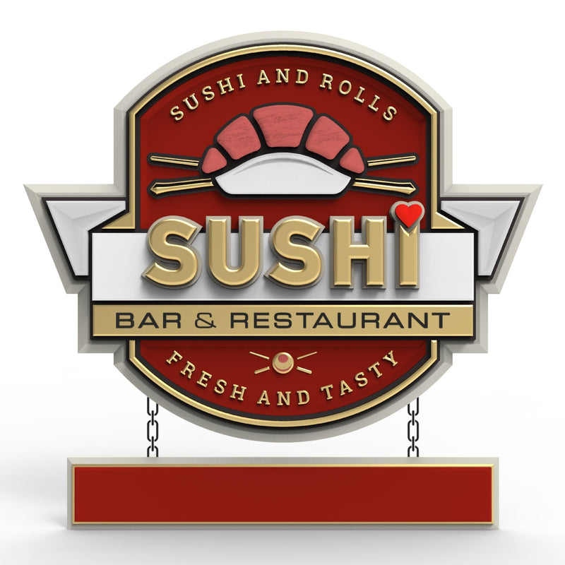
Getting high-quality 3D carved signs has never been this easy! We use only the highest quality material and paint finishes available for unmatched elegance and longevity. Check out Carved Signs and our outstanding sign collection. Just pick your style and customize it - we do the rest! Feel free to contact us online or call us at +1 (970)-455-8443.
