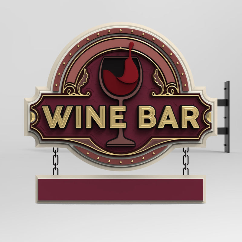
Introduction
Carved signs are a timeless and sophisticated way to showcase a business’s name, logo, or message. These signs are not just visually appealing, but their readability and impact are influenced by several factors. Among the most crucial considerations in designing a carved sign are the viewing distance and letter sizing.
Understanding the relationship between how far away a viewer is from the sign and the size of the lettering is essential for ensuring that the sign communicates its message effectively. If the lettering is too small, it may be hard for passersby to read, while overly large lettering may overwhelm the design or look out of place. Therefore, getting the right balance between the two is vital for maximizing the sign’s visibility and overall effectiveness.
In this article, we’ll delve into the science behind viewing distance and letter sizing in carved signs, explaining how these two elements work together to create signage that catches attention and communicates clearly.
The Science Behind Viewing Distance and Letter Sizing in Carved Signs
Understanding Viewing Distance
Viewing distance refers to how far away someone is when reading a sign. The farther the viewer is, the larger the letters will need to be for them to read the text. However, there are more nuanced aspects to consider regarding how viewing distance affects the perceived readability of a carved sign.
-
Minimum Viewing Distance
This is the closest a person can be while still being able to read the text comfortably. For instance, a sign with small text might require a person to be at least 5 feet away to clearly see the details. If the viewer is too close, the text may appear blurry or illegible. -
Optimal Viewing Distance
The optimal viewing distance varies based on the size of the sign and the text. It’s the distance at which the text is most readable without straining the eyes. The optimal viewing distance is typically calculated based on the size of the letters and the resolution of the sign's design. -
Maximum Viewing Distance
Maximum viewing distance refers to the farthest distance a person can be and still recognize the letters. For businesses, this distance is crucial to ensure that the sign stands out even in a crowded or highly visual area.

The Role of Letter Sizing in Carved Signs
Letter sizing is one of the most influential factors in how well a carved sign communicates its message. But the size of the letters must be determined by the viewing distance for optimal effectiveness.
-
Font Size and Legibility
The legibility of a sign depends heavily on its font size. A common rule of thumb is that the larger the letters, the more easily they can be read from a distance. However, this relationship isn’t linear. Simply increasing the size of letters won't always guarantee better readability; the spacing, thickness, and font choice play significant roles. -
The 1/10 Rule for Letter Height
A widely accepted guideline in the sign industry is the "1/10 rule," which suggests that the letter height should be at least 1/10th of the distance from which the sign is to be viewed. For example, if a viewer will be looking at the sign from 30 feet away, the letters should be at least 3 feet tall for optimal readability. -
Font Style and Design
The style of the font can also impact how readable it is from different distances. Carved signs often feature serif or sans-serif fonts, with serif fonts offering more classic and traditional looks. However, some serif fonts can become hard to read from a distance due to their intricate details. In contrast, sans-serif fonts, which have cleaner and more straightforward lines, tend to be more legible from further away. -
Contrast and Color Choices
The contrast between the letter color and the background color is also essential for visibility. A high contrast ensures that the text stands out against the background, even from a distance. For example, a dark color like black on a light background or a light color like white on a dark background works well for carved signs. -
Sign Size and Proportionality
The size of the sign as a whole, including the height and width, influences the perceived letter size. A larger sign allows for bigger letters, making the text easier to read from a greater distance. However, if the sign is too large for the intended space, it could be overpowering. The proportions of the sign should align with the environment in which it is placed.
Calculating the Optimal Letter Size
To determine the optimal letter size for a carved sign, you need to calculate the viewing distance based on the space and how far away people will typically be when trying to read the sign. While general rules can help, the specifics of your location should always be considered.
-
General Sizing Guidelines
For a quick reference: -
For a sign viewed from up to 10 feet: Letters should be at least 1 inch tall.
-
For a sign viewed from up to 20 feet: Letters should be at least 2 inches tall.
-
For a sign viewed from 50 feet: Letters should be at least 5 inches tall.
-
For a sign viewed from 100 feet: Letters should be at least 10 inches tall.
-
Environmental Considerations
Urban and rural settings will also influence the letter size. In high-traffic areas, where people are constantly moving, slightly larger letters may be required for effective communication. In quieter, less busy areas, smaller letters may suffice. -
Testing and Adjustments
After determining your ideal letter size based on these calculations, it is always a good idea to test the sign in its actual environment. View it from different angles and distances, ensuring the lettering is legible in all scenarios.

FAQs (Frequently Asked Questions)
Q1: How do I know if my carved sign has the right letter size?
To ensure the right letter size, start by considering the distance from which the sign will be viewed. Use the 1/10 rule or consult with a professional to determine the minimum letter height for readability. Always test the sign in its intended location.
Q2: Does the font style affect the visibility of my sign?
Yes, font style can significantly affect visibility. Simple sans-serif fonts are often more legible from a distance compared to decorative or serif fonts.
Q3: Can I use a smaller font size for my carved sign if it's placed in a well-lit area?
Lighting can improve readability, but it doesn’t replace the need for proper letter sizing. A well-lit sign can be easier to read, but the font should still be appropriately sized for the intended viewing distance.
Q4: How far away should a carved sign be visible from?
The ideal viewing distance for a carved sign depends on its purpose and location. However, a good rule of thumb is to aim for visibility from at least 30-50 feet away for maximum impact.
Q5: What is the best material for carved signs to ensure legibility from a distance?
Carved signs can be made from various materials, including wood, acrylic, and metal. Each material has unique qualities that can impact legibility, with materials like acrylic offering crisp, clean edges and metal providing a polished, professional look.
Q6: How can I test if my carved sign is readable from the desired distance?
A simple way to test readability is to view the sign from several distances and angles. You can also ask others to provide feedback on readability. If necessary, adjust the letter sizing, contrast, or sign placement.
Conclusion
Creating a carved sign that is both visually appealing and functional requires careful consideration of factors like viewing distance and letter sizing. The science behind these elements ensures that the sign can be read by people from various distances, whether they are walking by, driving, or passing on foot.
By understanding the relationship between viewing distance and letter sizing, businesses can make informed decisions when designing their carved signs. Whether you’re aiming to attract local foot traffic or catch the eye of passing motorists, a well-designed carved sign will communicate your message clearly and effectively.
When designing a carved sign, always remember to balance aesthetics with practicality. With the right combination of viewing distance, letter sizing, and materials, your carved sign can make a lasting impression and serve as an effective marketing tool for your business.
Getting high-quality 3D carved signs has never been this easy! We use only the highest quality material and paint finishes available for unmatched elegance and longevity. Check out Carved Signs and our outstanding sign collection. Just pick your style and customize it - we do the rest! Feel free to contact us online or call us at +1 (970)-455-8443.
