Introduction
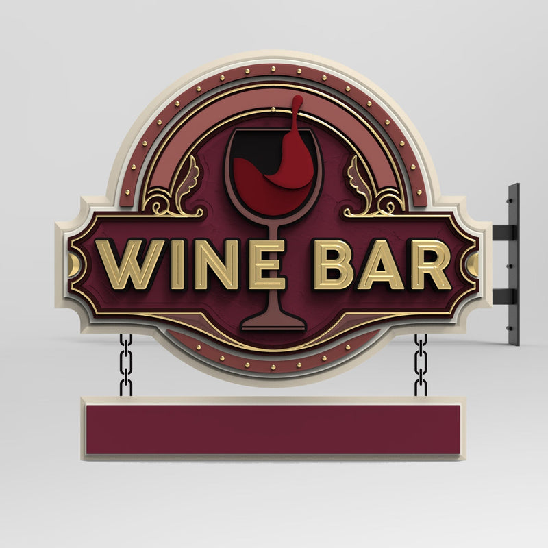
Carved signs are a timeless signage solution that adds sophistication and permanence to any business. Unlike printed or vinyl signs, carved signs offer depth, texture, and a tactile quality that can significantly influence how a message is perceived. One often overlooked aspect of carved sign design is the interplay between texture and typography. The way fonts are carved into a surface—whether deeply chiseled, lightly etched, or rough-hewn—affects not only the aesthetic appeal but also the effectiveness of the message.
Choosing the right texture and font combination is critical in ensuring a sign is both visually striking and functionally effective. In this article, we will explore how texture and font choices work together to create a stronger message in carved signs, helping businesses communicate their brand identity with clarity and impact.
How Texture Works with Font Choices to Create a Stronger Message in Carved Signs
1. The Role of Texture in Carved Signs
Texture in carved signs can take many forms, from smooth and polished to rough and rustic. The surface texture of the sign affects how light interacts with the carved elements, influencing readability and overall perception. Some key considerations include:
-
Smooth Finishes: A polished, refined look that enhances readability and conveys professionalism.
-
Rough or Weathered Finishes: A more rustic or traditional aesthetic that can evoke a sense of heritage and craftsmanship.
-
Deep Relief vs. Shallow Etching: Deeply carved letters create dramatic shadows that enhance visibility, while shallow etching provides a subtle and elegant effect.

2. Font Styles and Their Impact on Messaging
Fonts play a crucial role in reinforcing a brand’s message. In carved signage, the way a font is rendered into the material can enhance or diminish its impact. Here’s how different font styles interact with carved textures:
-
Serif Fonts (e.g., Times New Roman, Garamond): These fonts have small decorative strokes at the ends of letters, making them ideal for businesses that want to convey tradition, elegance, or authority. When deeply carved into wood or stone, serif fonts appear timeless and distinguished.
-
Sans-Serif Fonts (e.g., Helvetica, Arial): Without decorative strokes, sans-serif fonts offer a modern, clean look. They work well in shallow etching and polished finishes, ensuring easy readability and a contemporary feel.
-
Script and Handwritten Fonts: These fonts add personality and a handcrafted feel but require careful carving to maintain legibility. They work best with smooth or slightly textured backgrounds to prevent the details from getting lost.
-
Bold and Blocky Fonts: Thick, prominent fonts carved into wood or stone create a strong visual impact. These fonts work well for businesses that want to project strength, durability, or stability.
3. The Interaction Between Font and Material
The material used for a carved sign influences how texture and fonts interact. Consider the following:
-
Wood: Grain patterns can enhance or interfere with readability. Bold fonts work well with deeply carved designs, while intricate fonts may require smoother finishes.
-
Stone: Marble, granite, or slate can provide a luxurious appearance. Serif and script fonts often look elegant when etched into polished stone surfaces.
-
Metal: Carved metal signs can achieve a sleek, high-end aesthetic. Laser-cut or engraved fonts should be chosen to maintain clarity and precision.
-
HDU (High-Density Urethane): A popular alternative to wood, HDU allows for deep carving with intricate details, making it versatile for various font styles.
4. Enhancing Readability with Texture and Font Pairings
To ensure that a carved sign effectively conveys its message, it’s essential to optimize readability through texture and font pairings. Here are some best practices:
-
Contrast Matters: Light-colored lettering on a darker background (or vice versa) enhances visibility.
-
Depth and Shadow Play: Deep carvings create natural shadows, making letters more legible in different lighting conditions.
-
Finishing Techniques: A gloss finish can make text pop, while a matte or sandblasted finish reduces glare and provides a softer look.
-
Avoiding Overly Intricate Designs: Highly detailed fonts may lose clarity when carved into certain materials, especially those with pronounced textures.

FAQs (Frequently Asked Questions)
Q1: What is the best font for readability in carved signs?
The best fonts for readability in carved signs are bold serif or sans-serif fonts. Fonts like Garamond, Helvetica, and Futura provide clarity and impact, especially when paired with deep carving techniques.
Q2: How does texture affect the durability of a carved sign?
Texture can influence how a sign weathers over time. Rough textures may trap dirt and require more maintenance, while smoother textures with proper sealants can resist weathering and prolong the sign’s lifespan.
Q3: Can any font be used for a carved sign?
While most fonts can be carved, some highly intricate or ultra-thin fonts may lose legibility, especially on textured materials. It’s best to consult with a sign designer to ensure the font choice works well with the material and carving depth.
Q4: How do different materials impact font visibility?
Materials with natural patterns, like wood grain or stone veins, can either enhance or obscure text. Choosing the right carving depth and paint contrast can ensure visibility regardless of the material.
Q5: What finishing options improve readability in carved signs?
Painted lettering, gold leafing, or backlighting can enhance readability. A smooth, sealed surface also prevents shadows or glare from distorting the text.
Q6: Are carved signs suitable for modern branding?
Absolutely! While traditionally associated with classic or rustic aesthetics, modern design techniques allow carved signs to fit contemporary branding. Pairing sleek fonts with clean carving and innovative finishes can create a modern yet timeless look.
Conclusion
Texture and font choices in carved signs are more than just design elements—they are crucial factors that influence how effectively a message is conveyed. By understanding how different textures interact with various font styles, businesses can create signage that is not only visually appealing but also highly functional. Whether aiming for a classic, elegant feel or a bold, modern statement, the right combination of texture and typography ensures a carved sign stands out and communicates its intended message with impact.
When investing in a carved sign, businesses should work closely with a professional sign maker to select the best materials, textures, and fonts to achieve the desired look and readability. A well-crafted carved sign serves as a long-lasting representation of a brand’s identity, reinforcing trust and professionalism with every passerby.
Getting high-quality 3D carved signs has never been this easy! We use only the highest quality material and paint finishes available for unmatched elegance and longevity. Check out Carved Signs and our outstanding sign collection. Just pick your style and customize it - we do the rest! Feel free to contact us online or call us at +1 (970)-455-8443.
