Introduction
When it comes to creating signage that communicates clearly and leaves a lasting impression, the smallest design choices can have significant psychological effects. Among the most important of these decisions is the use of curved lines versus sharp angles. Whether you're designing a carved wooden sign, a dimensional acrylic display, or a large exterior wall feature, the contouring of your sign—smooth or angular—plays a major role in how people perceive your brand.
Curved lines and sharp angles carry very different emotional weights. They influence how viewers interpret the tone of a message, the professionalism of a business, and even how approachable a space feels. Understanding how these elements shape viewer perception can help businesses choose the right style for their signage.
This article explores the visual, emotional, and functional differences between curved lines and sharp angles in signage—especially carved signs—and how they can influence your brand presentation.
How Curved Lines vs. Sharp Angles Influence a Sign’s Feel
The Psychology of Shape in Visual Design
In design, shapes and contours do more than decorate—they influence how people feel. According to psychological studies in visual communication, shapes can trigger instinctive emotional reactions. Curves tend to evoke calmness and friendliness, while angles are often associated with strength, decisiveness, or even danger.
Signage, by its very nature, is a visual ambassador. The curves or angles used in carved signs contribute to how people interpret the business before ever walking through the door.
Curved Lines: Softness, Approachability, and Flow
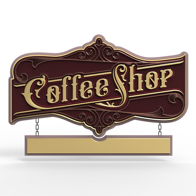
Curved lines are naturally associated with movement, organic form, and gentleness. When incorporated into carved signs, they tend to soften the overall appearance and make a space feel more welcoming.
Emotional Associations
-
Friendliness: Curves create a sense of openness and approachability. Businesses that want to come across as inviting, such as cafés, wellness centers, boutiques, and childcare providers, often favor curved features.
-
Creativity: Because curves mimic natural elements like waves, vines, or clouds, they’re often used to evoke artistry and imagination. They’re common in signs for creative industries or leisure services.
-
Comfort: The eye naturally follows a curve more fluidly than a sharp angle, leading to a smoother visual experience that feels calming.
Functional Design Benefits
-
Versatility with Fonts and Logos: Curved lettering can enhance flow and rhythm, especially when used with script fonts or logo emblems with circular or wavy motifs.
-
Integration with Organic Materials: Curves work particularly well with natural materials like wood, where the grain can enhance a smooth, flowing design.
Sharp Angles: Precision, Strength, and Authority
In contrast, sharp angles convey a very different message. With their straight edges and abrupt turns, angled elements suggest power, discipline, and clarity.
Emotional Associations
-
Professionalism: Businesses in law, finance, architecture, or engineering may favor signs with angular forms to suggest expertise and order.
-
Strength and Confidence: Angular shapes communicate a no-nonsense attitude. They're commonly found in signs for high-end retail, corporate headquarters, and technology firms.
-
Urgency or Efficiency: Angles demand attention. They direct the eye to key information quickly and can create a sense of urgency or decisiveness.
Functional Design Benefits
-
Strong Line Definition: Angular signs have crisp edges and defined structure, making them easier to read at a distance.
-
Modern Appeal: Angular shapes tend to feel sleek and contemporary, aligning with modernist architecture or minimalist branding.

Combining Curves and Angles: Balance and Intentionality
Not every sign has to pick a side. Many of the most compelling carved signs artfully combine both curved and angular elements. This approach can create a layered message that speaks to both emotion and logic.
For example:
-
A tech startup may use a bold, angular logotype with subtle rounded corners to suggest innovation with warmth.
-
A wellness clinic might pair a soft, circular icon with a clean, geometric typeface to signal both care and professionalism.
Strategic blending allows businesses to fine-tune their brand message. The key is to maintain visual harmony and ensure each element serves the overall tone you want to communicate.
Application in Carved Signs: What to Consider
When designing a carved sign, especially one made from wood, PVC, or HDU (high-density urethane), it's essential to match the material’s capabilities to the design intent.
Carved Curves
-
Work well with rotary or hand-carving tools.
-
Can be enhanced with dimensional carving techniques like bas-relief or rounded letter embossing.
-
Suited for logos or text that need to feel flowing and integrated into the environment.
Carved Angles
-
Best achieved with CNC routing for precision.
-
Sharp corners and V-grooves add depth and definition.
-
Effective for bold letterforms, rigid iconography, or complex border framing.
The level of relief, paint or stain choice, and the finish (matte vs. glossy) will further affect how light interacts with curves or angles, subtly influencing how viewers perceive the sign throughout the day.
Industry Examples and Visual Impact
Hospitality
-
Curved signs: Spas, resorts, and boutique hotels often prefer signs with soft wave-like contours and rounded lettering, creating an air of calm luxury.
-
Angular signs: Modern hotels and upscale restaurants may use minimalist, geometric signs to convey exclusivity and precision.
Retail
-
Curved signs: Children’s shops, florists, and artisanal bakeries benefit from whimsical, approachable forms.
-
Angular signs: Electronics stores, auto dealerships, and furniture showrooms often favor bold edges and rectangular structures.
Corporate and Professional Services
-
Curved elements: Used sparingly to add friendliness without compromising professionalism.
-
Sharp angles: Frequently used in legal offices, financial institutions, or architectural firms to reflect credibility and authority.

FAQs (Frequently Asked Questions)
Q1: Can curved and angled elements be used together effectively in one sign?
Yes, blending curves and angles is a common design strategy. When done thoughtfully, it can create visual interest and convey a balanced brand message—friendly yet professional, creative yet reliable.
Q2: Are curved lines harder to carve than sharp angles?
It depends on the material and tools used. Curved lines often require more manual craftsmanship or advanced routing for smooth results, while angles can typically be cut more quickly with straight-line tools or CNC machines.
Q3: Which shapes are better for outdoor visibility?
Sharp angles generally stand out more at a distance due to their defined lines. However, large curved designs with high contrast can also be very effective if sized appropriately and paired with good lighting.
Q4: What materials work best for curved carved signs?
Wood and HDU are both excellent materials for carved curved signs. Their workability allows for smooth shaping and finishing, whether by hand or machine.
Q5: Are angular signs perceived as too harsh or aggressive?
Not necessarily. While angles can be bold or assertive, they’re often viewed as strong and dependable. When balanced with softer colors or subtle textures, the overall effect can be refined rather than harsh.
Q6: How do I decide which is right for my business?
Start with your brand values. If your business is focused on care, creativity, or warmth, curves may be the right choice. If your identity revolves around strength, structure, or cutting-edge technology, sharp angles may suit you better.
Conclusion
The decision between curved lines and sharp angles in signage design is more than just aesthetic. These shapes carry strong psychological cues that can influence how potential customers view your brand—before they even walk in the door.
Curved lines bring warmth, creativity, and approachability to carved signs. Sharp angles deliver clarity, strength, and modernity. Combining both, when done with intention, creates a rich visual identity that’s memorable and effective.
For businesses investing in carved signage, understanding these design principles is key to creating a sign that not only looks great but feels aligned with your brand’s message. Whether you lean into smooth curves, bold edges, or a custom combination of both, the right visual language can speak volumes.
Getting high-quality 3D carved signs has never been this easy! We use only the highest quality material and paint finishes available for unmatched elegance and longevity. Check out Carved Signs and our outstanding sign collection. Just pick your style and customize it - we do the rest! Feel free to contact us online or call us at +1 (970)-455-8443.
