Introduction
Storefront signs are often the first impression a business makes. The right sign draws attention, communicates professionalism, and guides potential customers inside. While factors like color, font, and size are often discussed, background texture is another design choice that can influence how effective a sign is. Business owners considering carved or dimensional signs often ask: do textured backgrounds make storefront signs easier to read, or do they distract from the main message?
This question matters because readability is at the core of successful signage. If a sign looks attractive but customers struggle to quickly read it, the investment falls short of its purpose. On the other hand, a well-designed textured background can create contrast, improve visibility, and make lettering stand out even in challenging environments.
In this article, we’ll take an in-depth look at how textured backgrounds affect storefront sign readability. We’ll cover how textures interact with lighting, color, and letter styles; when they enhance clarity; and when they may reduce legibility. By the end, business owners will have a clear understanding of whether textured backgrounds are a good choice for their signage.
Do Textured Backgrounds Make Storefront Signs Easier to Read?
1. The Role of Readability in Sign Effectiveness
The primary function of a storefront sign is communication. For signs to be effective, they must be legible from the appropriate viewing distance—whether that’s across a street, from a passing car, or while walking down a busy sidewalk. Legibility depends on several factors, including:
-
Font style and size – Simple, bold lettering is easier to read.
-
Color contrast – High contrast between lettering and background improves visibility.
-
Lighting – Natural and artificial lighting impact how text is perceived.
-
Background treatment – This includes whether the background is flat, painted, or textured.
Textures influence how light interacts with the sign and how the eye distinguishes between the background and lettering. If done correctly, textures can add depth and definition, creating a sharper separation between the letters and their surroundings.
2. How Textures Enhance Visibility
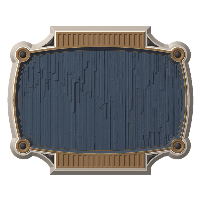
Textured backgrounds can create visual separation that helps lettering stand out. For example, a carved sign with a sandblasted or wood-grain background naturally casts subtle shadows. These shadows can enhance the contrast between raised or engraved letters and the background.
Key ways textured backgrounds may improve readability:
-
Depth and contrast – Textures create small areas of light and shadow that emphasize flat or dimensional letters.
-
Reduced glare – A matte, textured background scatters light instead of reflecting it, making signs easier to read in bright sunlight.
-
Visual framing – Texture can act like a frame, guiding the viewer’s eye toward the text rather than letting it blend into the background.
-
Professional appearance – Well-crafted textures often suggest craftsmanship, which can boost the perception of quality and trust.
3. Situations Where Textures May Hurt Readability
Not all textures are helpful. In some cases, they may create unnecessary visual “noise” that distracts from the message.
Potential readability challenges include:
-
Overly complex textures – Intricate patterns may compete with lettering for attention.
-
Low-contrast color schemes – If the lettering color is too similar to the textured background, the sign can appear muddled.
-
Small fonts – Fine details can get lost when paired with textured backgrounds, especially from a distance.
-
Improper lighting – At night, shadows created by textures may obscure lettering instead of enhancing it.
The key is balance. A subtle, consistent texture can improve legibility, but bold or overly varied patterns may harm it.

4. The Impact of Material Choice
Different sign materials produce different types of textures, each with its own effect on readability.
-
Wood – Natural wood grain provides organic texture that works well with carved or painted lettering.
-
Sandblasted finishes – These create a consistent matte texture that enhances contrast and reduces glare.
-
HDU (high-density urethane) – Often used in carved signs, HDU can be shaped into controlled, even textures.
-
Metal – Brushed or patterned metal may reflect light differently, requiring careful letter design for readability.
Choosing the right material and finish allows business owners to control how texture supports legibility.
5. Design Principles for Textured Background Signs
To ensure readability while benefiting from texture, consider these principles:
-
High contrast is essential – Light letters on dark textured backgrounds (or vice versa) work best.
-
Simplify fonts – Clean, bold fonts balance the visual complexity of textured surfaces.
-
Consider distance – From a distance, textures should fade into the background rather than compete with text.
-
Lighting integration – For illuminated signs, ensure the lighting highlights the lettering instead of casting shadows that reduce clarity.
-
Test visibility – Viewing mock-ups from multiple angles and distances helps confirm readability.
6. Psychological and Branding Effects
Beyond pure legibility, textured backgrounds contribute to the feel of a sign. They can suggest tradition, craftsmanship, or modern sophistication depending on the style. For example:
-
A wood-grain texture communicates warmth and heritage, ideal for restaurants or boutiques.
-
Sandblasted finishes suggest professionalism and durability, suitable for law firms or medical offices.
-
Subtle stone or brick-like patterns can align with architectural themes, reinforcing brand identity.
By shaping customer perception, textures can make a sign not only easier to read but also more memorable.

FAQs ( Frequently Asked Questions)
Q1: Do textured backgrounds always make storefront signs easier to read?
No. Textures can enhance readability by creating contrast and reducing glare, but overly complex or brightly colored textures may make signs harder to read. The design must balance simplicity with depth.
Q2: What types of textures work best for carved signs?
Subtle textures such as sandblasted finishes, vertical grain patterns, or lightly carved backgrounds work well. They add depth without overwhelming the lettering.
Q3: How do lighting conditions affect textured signs?
Natural light highlights textures during the day, often making signs more readable. At night, poorly placed lighting can cast shadows that obscure text, so proper illumination is critical.
Q4: Are textured backgrounds better for large or small signs?
They are typically more effective on medium to large signs where textures remain subtle at a distance. On very small signs, textures may compete with lettering and reduce clarity.
Q5: Can textured signs be used in modern storefronts, or do they only suit traditional styles?
Textured signs can fit both. Clean, minimal textures work well in modern designs, while wood-grain or sandblasted textures suit more traditional settings. The choice depends on brand identity.
Q6: What should businesses prioritize when deciding on a textured background?
Readability should always come first. While texture adds character, the lettering must remain clear from the intended viewing distance. High contrast and font choice are more important than the background pattern itself.
Conclusion
Textured backgrounds can make storefront signs easier to read when applied thoughtfully. By adding depth, reducing glare, and providing visual separation, textures enhance lettering and draw attention. However, readability is not guaranteed simply by adding texture—designers must balance contrast, font choice, material, and lighting to achieve the desired effect.
For businesses considering carved or dimensional signage, textured backgrounds offer both aesthetic and functional benefits. They can support branding, create a polished appearance, and improve legibility in many settings. But the ultimate measure of success is whether the sign communicates clearly, quickly, and effectively to potential customers.
When planning a storefront sign, business owners should consult with experienced sign makers who understand how to integrate texture without sacrificing clarity. Done correctly, textured backgrounds don’t just add style—they strengthen a sign’s ability to do its job: attract attention and bring people in.
Getting high-quality 3D carved signs has never been this easy! We use only the highest quality material and paint finishes available for unmatched elegance and longevity. Check out Carved Signs and our outstanding sign collection. Just pick your style and customize it - we do the rest! Feel free to contact us online or call us at +1 (970)-455-8443.
