Introduction
When designing a carved sign, texture plays an essential role in how people see and understand your message. Beyond color and font, texture adds depth, character, and visual hierarchy that can dramatically affect readability. Two main types of texture are commonly used in sign design, background texture and letter texture. Each creates a unique look and influences how the eye perceives the words on the sign.
Choosing the right texture for your sign isn’t just an artistic decision — it’s a practical one. The right balance between textured and smooth areas determines how quickly someone can read your sign from a distance, in motion, or under different lighting conditions.
This article explores both options in depth, explaining how each affects readability, style, and viewer perception. By understanding how textures interact with typography and surroundings, you’ll be better equipped to choose the right approach for your next carved sign project.
Background Texture vs. Letter Texture: Which Improves Readability More?
Understanding Texture in Carved Signs
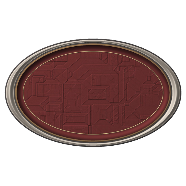
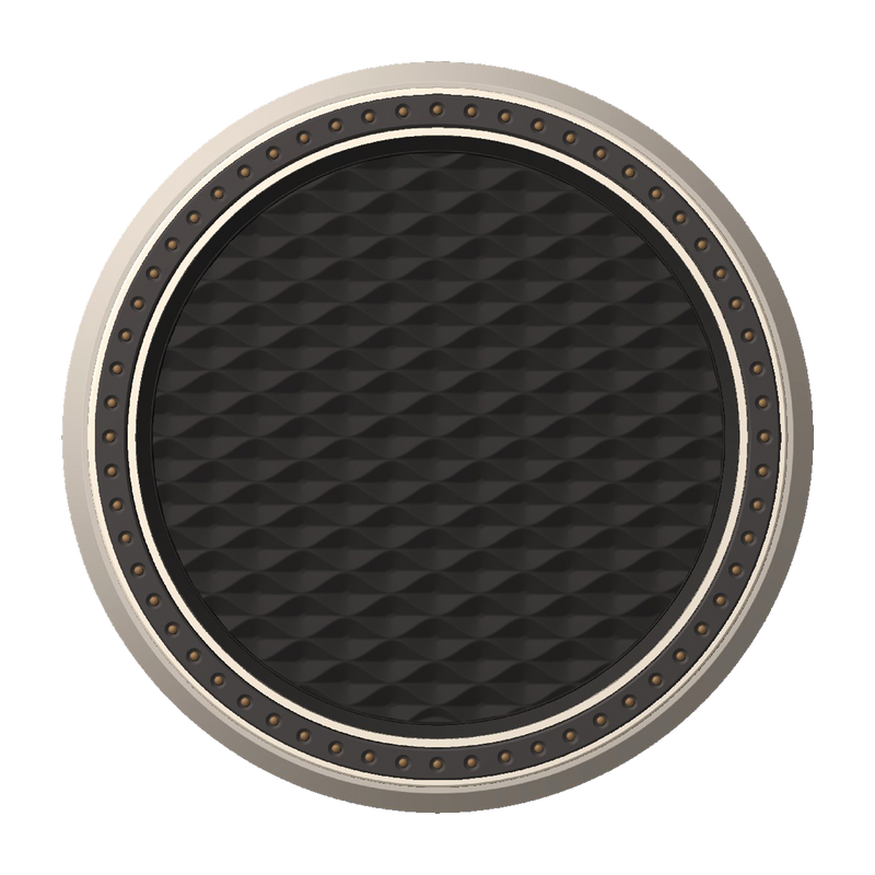
In sign design, texture refers to the surface variation that creates depth or pattern. A carved sign might use background texture — where the recessed or surrounding area has a tactile finish — or letter texture, where the raised lettering itself is carved, sandblasted, or patterned.
Textures catch light differently, creating subtle shadows that make letters pop or blend. When used effectively, texture adds dimension without sacrificing clarity. But if used carelessly, it can distract from the main message or reduce contrast.
Background Texture: Creating Contrast and Depth
Background texture involves adding visual or physical depth to the area behind the letters. This technique is common in sandblasted cedar signs, HDU panels, and painted wood signs. The goal is to make the letters stand out clearly against a textured surface.
Benefits of Background Texture
-
Improved Letter Contrast:
A rough or patterned background creates visual separation, allowing smooth or raised letters to stand out sharply. -
Consistent Readability:
Because the texture lies behind the text, it enhances contrast without disrupting letterforms. Even intricate fonts remain readable. -
Enhanced Lighting Effects:
When sunlight or artificial light hits the sign, the textured background creates shadows that emphasize the lettering even more. -
Design Flexibility:
Background textures can mimic materials like stone, wood grain, or stucco, giving designers the freedom to match a brand’s aesthetic or building façade. -
Durability and Maintenance:
Textured backgrounds can mask minor wear or dirt accumulation over time, maintaining visual appeal longer.
Potential Drawbacks
-
If the texture is too deep or busy, it can create visual noise that distracts from the text.
-
Overly dark or uneven finishes can reduce letter clarity under poor lighting conditions.
In general, a well-designed background texture enhances readability because it separates the lettering from its environment without altering the letter’s shape.

Letter Texture: Adding Character and Dimension
Letter texture focuses on the raised or carved letters themselves. Techniques like sandblasting, engraving, or routed finishes can add tactile or visual depth to the letter surfaces. The purpose is often aesthetic — to create a more custom or artistic look.
Benefits of Letter Texture
-
Distinctive, Premium Appearance:
Textured letters give a handcrafted, high-quality look that adds sophistication to the sign. -
Material Highlighting:
Letter texture works well with natural materials such as wood, stone, or metal, showcasing the craftsmanship. -
Subtle Brand Personality:
A brushed metal or woodgrain letter texture can reinforce brand identity — for instance, a rustic café or boutique might use letter texture for warmth and charm. -
Tactile Engagement:
For indoor signs or close-range viewing, textured letters encourage touch and curiosity.
Potential Drawbacks
-
Texturing the letters themselves can sometimes reduce legibility, especially from a distance.
-
Uneven light reflections can cause glare or shadowing, making the letters harder to read.
-
Complex patterns on letters may clash with certain fonts, particularly thin or script styles.
For readability, letter texture can add style but must be handled with care. The effect is strongest when subtle — enhancing visual depth without interrupting letterform clarity.
Comparing the Two: Readability and Visual Impact
|
Feature |
Background Texture |
Letter Texture |
|
Readability |
High, due to clear letter contrast |
Moderate, may vary with lighting |
|
Best Use Case |
Outdoor signs, distant viewing |
Indoor or close-up signs |
|
Design Focus |
Depth and contrast |
Artistic or brand detailing |
|
Lighting Response |
Excellent shadow play |
May cause highlights or glare |
|
Maintenance |
Hides wear and dust |
May require cleaning for clarity |
When readability is the top priority, background texture generally performs better. It separates the text from its surroundings, allowing smooth or flat lettering to catch the eye easily. However, for signs meant to impress at closer distances — like lobby plaques or boutique signage — letter texture can create an elegant, memorable effect.
Factors That Influence Readability
Several key design elements determine whether background or letter texture will work best for your sign:
-
Lighting Conditions:
Natural or directional lighting can dramatically change how texture appears. A sign in full sunlight benefits from subtle textures, while one in shaded areas may need higher contrast between the background and letters. -
Viewing Distance:
If your sign needs to be readable from a street or parking lot, smooth letters on a textured background are best. For close-range settings like indoor displays, textured letters can add charm without sacrificing clarity. -
Letter Size and Font Choice:
Simple, bold fonts handle texture better than thin or script fonts. Adding texture to slender letter strokes can make them appear uneven or hard to read. -
Color and Contrast:
Texture interacts closely with color. Dark textured backgrounds with light letters often work best. Avoid pairing similar tones or matte finishes that blend together. -
Material and Finish:
HDU (High-Density Urethane), cedar, aluminum, and acrylic each respond differently to carving and paint. The right combination ensures texture depth without sacrificing legibility.

FAQs (Frequently Asked Questions)
Q1: Which texture type is better for outdoor signs?
Background texture is usually better for outdoor signs because it enhances contrast and visibility from various distances and lighting angles. Smooth letters against a textured backdrop stand out clearly, even in changing weather or light conditions.
Q2: Can letter texture still be readable from far away?
Yes, but only if applied subtly. Heavy or detailed textures on letters can reduce contrast and make the text appear distorted from afar. To maintain readability, use shallow or fine-grain letter textures and avoid overcomplicating the design.
Q3: How does lighting affect textured signs?
Lighting direction and intensity can make or break textured signs. Downlighting, side lighting, or natural sunlight creates shadows that highlight raised details. However, glare or uneven illumination can reduce readability if the texture reflects too much light.
Q4: Are textured signs more expensive to produce?
Typically, yes. Carving or sandblasting textures requires additional design and labour time. However, textured backgrounds are often more cost-effective than fully textured letters, as they enhance visibility without the need for intricate letter detailing.
Q5: What materials work best for textured signs?
HDU (High-Density Urethane) and cedar are top choices because they carve cleanly and hold textures well. HDU is particularly resistant to weathering and allows for precise, consistent texture patterns. Cedar offers a natural grain that enhances depth for rustic or traditional looks.
Q6: Should I combine both background and letter textures?
It’s possible, but balance is key. Too much texture can overwhelm the design. A lightly textured background with subtly embossed or smooth letters usually offers the best visual hierarchy. The contrast should guide the viewer’s eye toward the message, not the material.
Conclusion
Both background texture and letter texture add valuable character to carved signs, but they serve different purposes. For most businesses focused on readability and impact, background texture offers the clearest advantage. It enhances letter visibility, maintains clean typography, and performs well under various lighting and distance conditions.
Letter texture, on the other hand, brings artistry and distinction, ideal for high-end boutiques, hotels, or offices where viewers engage up close. The key is moderation. A well-balanced design uses texture to enhance, not compete with, the lettering.
When designing your carved sign, consider your environment, audience, and brand image. A skilled sign maker can help you test sample finishes and textures before production, ensuring your sign is both beautiful and easy to read, day or night, up close or from afar.
Getting high-quality 3D carved signs has never been this easy! We use only the highest quality material and paint finishes available for unmatched elegance and longevity. Check out Carved Signs and our outstanding sign collection. Just pick your style and customize it - we do the rest! Feel free to contact us online or call us at +1 (970)-455-8443.